|
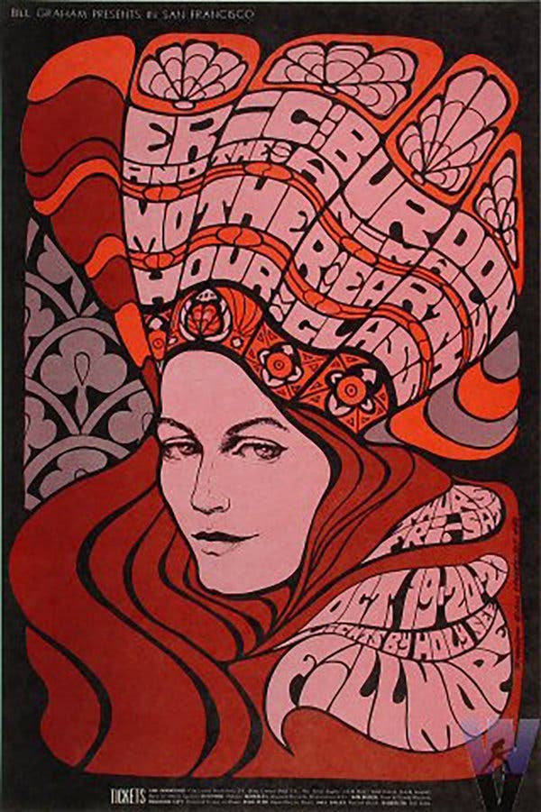
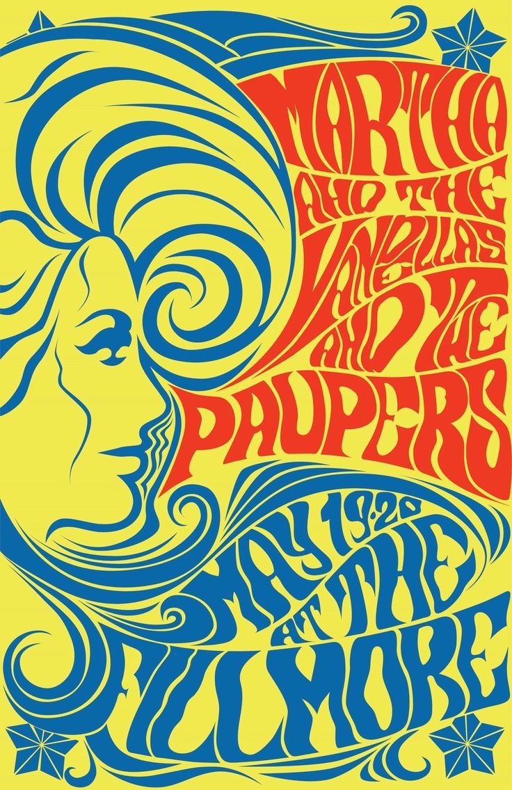
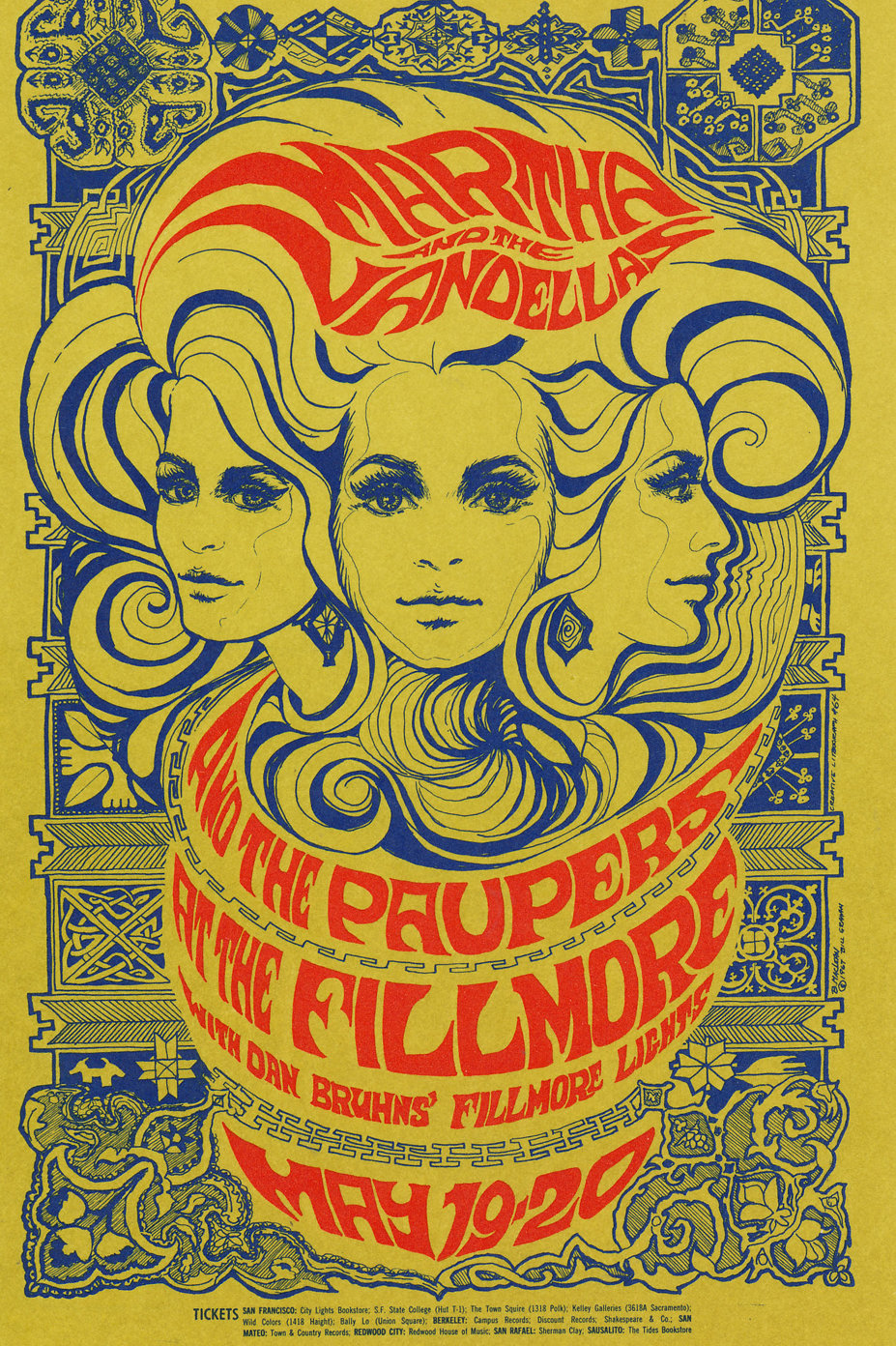
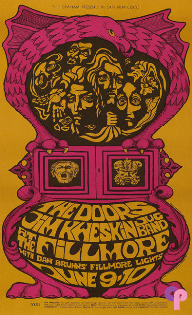
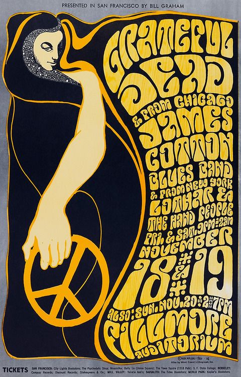
Bonnie Maclean was born in 1939 in Philadelphia, her work is highly recognizable for the years of the 1960’s and 1970’s psychedelic ‘hippy’ art movement. She produced posters for a wide variety of entertainment, clubs, concerts, live events and more. Maclean worked with a group of other artists during her time creating rock-band posters through her husband (at the time) Bill Graham’s organization. She was a girl in the ‘boys’ club but that didn’t get in the way when it came to creating her own style. The organization that Bonnie ended up being a part of was the Filmore Auditorium, she spent her time to begin with painting notice boards in the swirling psychedelic style, with the notice of her talent Bill Graham promoted her to Art Director when Wes Wilson left the organization due to a quarrel with Graham.
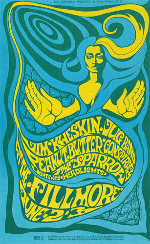 This detail is rather important when you view the two artists work, Maclean’s work in my opinion has a clear relationship with the work of Wes Wilson. Her work has similar influences such as the use of feathers to create a flowing effect over one of her pieces of work, with a similar resemblance in Wes Wilson’s. I also note a similar lay out and imagery, mainly consisting of just faces of people usually women such as the study of the few below, in my opinion Bonnie is influenced by Wilsons use of traditional symbols and ‘medieval’ looking designs which reflects historical patterns, this can be seen in her poster design with a strong traditional and Celtic vibe that features in the background. Although both artists have their own creative style, it is possible to notice the influence Wes had on Maclean, especially when his poster designs were more detailed and illustrative rather than his looser lined posters. https://www.classicposters.com/artist/bonnie-maclean https://wearecomet.com/1960s-psychedelic-tribute-calendar-bonnie-maclean/ https://www.bahrgallery.com/artist-master/bonnie-maclean
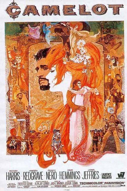
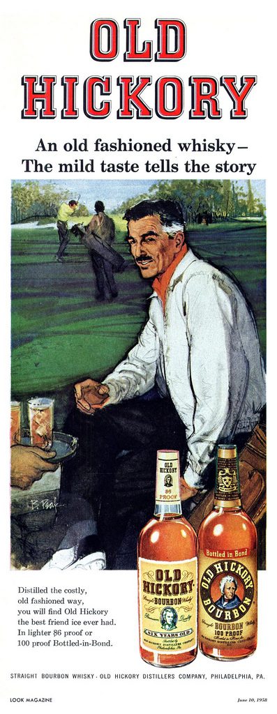
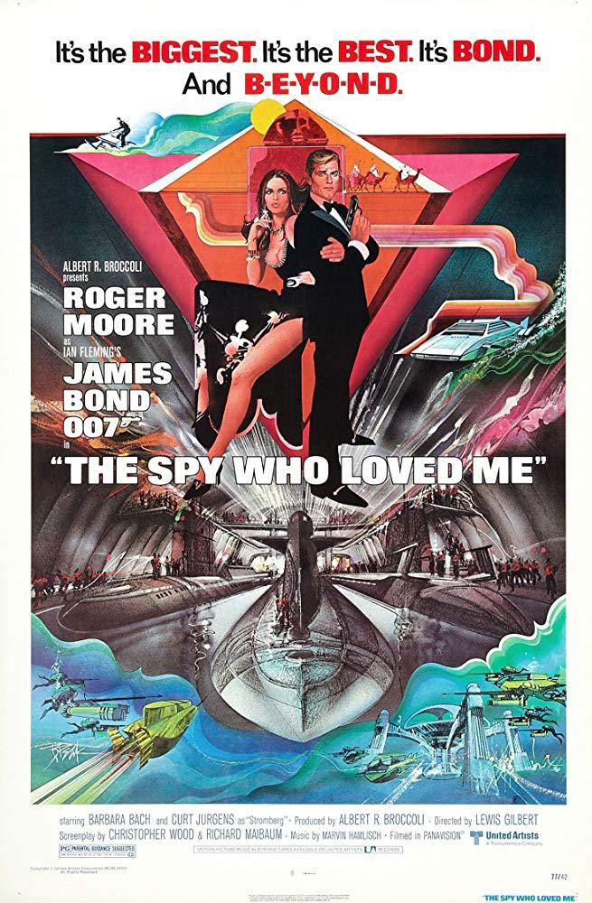
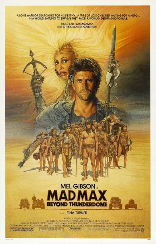
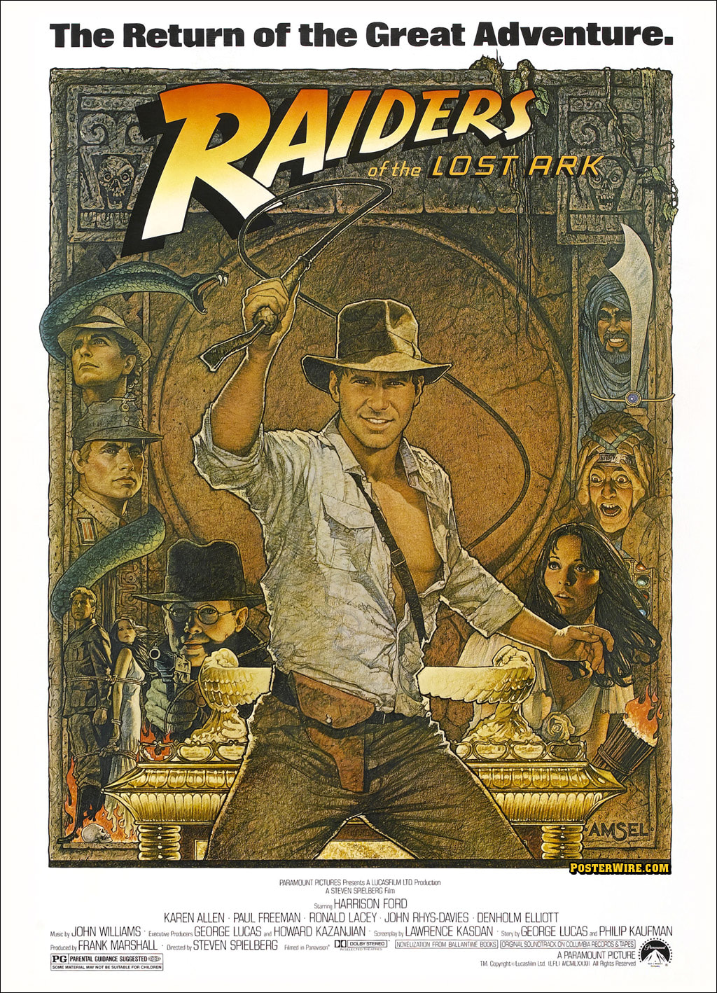
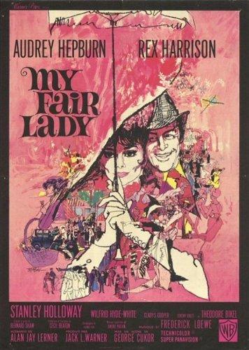 Bob Peak Known as one of the great Illustrators in America during the 1970’s Bob Peak was an influential Illustrator who brought a new meaning in the way of advertising posters, magazine covers but most importantly his creative outlook on designing Film posters. Bob Peak was born in Denver Colorado in 1927, he had strong artistic talents from a young age even though he did not fully utilize his skills until he studied at the Art Center College of Design in L.A. where he graduated in 1951. By 1953 Peak moved to New York with his wife as an Illustrator. During this time, he did not feel like his work stood out and it was quite mundane, from this he reinvented his illustrative style and enhanced his skills by incorporating striking contrasts, bright saturation, and vibrant drawings. This led him to land his first big break advertising for Old Hickory Whiskey, and from here his career rapidly grew. Bob Peak designed posters and magazine spreads for companies such as Sports Illustrators and posters for Cocoa-cola, but his design of West Side Story poster set him on another path. After the success of West Side Story Peak went on to design posters for some of the biggest film names in Hollywood during the 1970’s from Camelot to James Bond. Peak’s work throughout the years transformed movie posters into vibrant and innovating illustrations, from his work artists were heavily influenced by the realistic and bold designs that he was creating, this is apparent in the works of John Alvin and Richard Amsel. https://illustrationage.com/2018/08/07/turn-back-the-pages-bernie-fuchs/ https://www.richardamselmovie.com/single-post/2017/05/28/the-life-and-legacy-of-bob-peak https://bobpeak.com/about/ https://forcesofgeek.com/2013/06/bob-peak-american-illustrator-superstar.html http://linesandcolors.com/2009/06/12/bob-peak/
Bob Peak
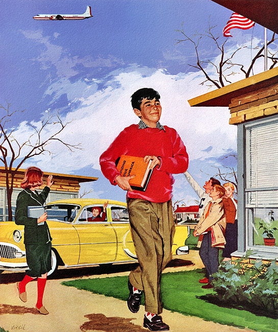
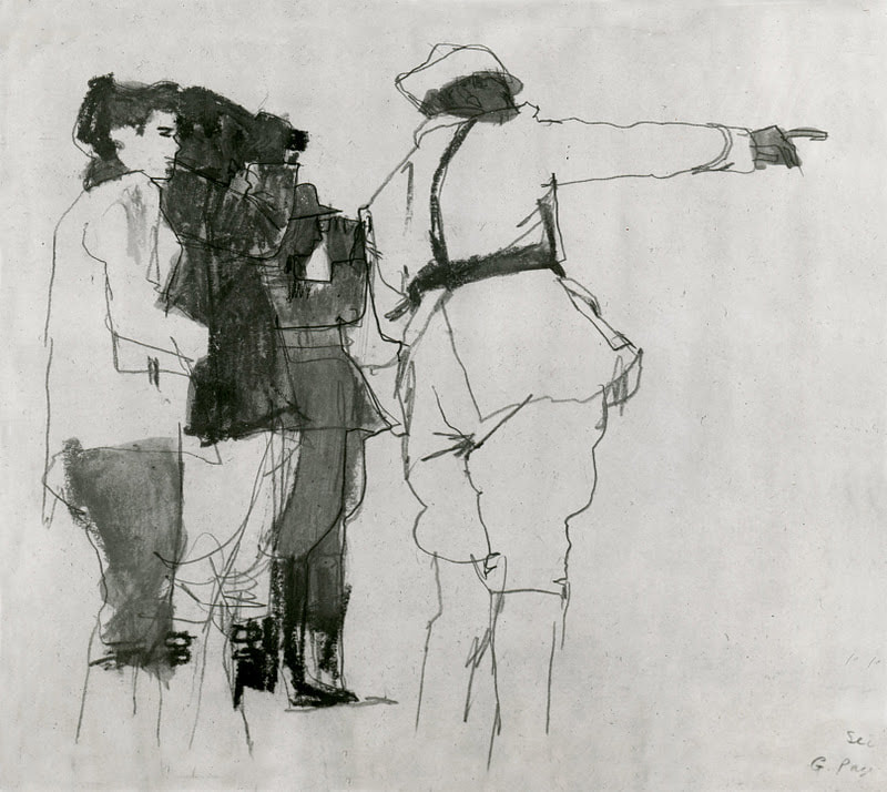
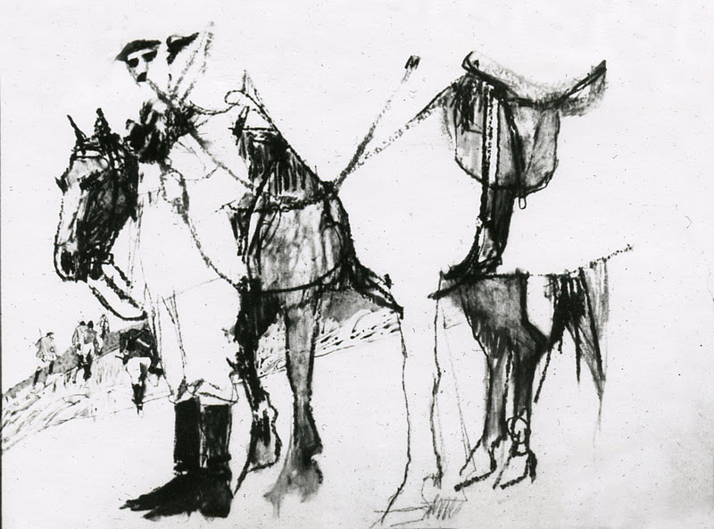
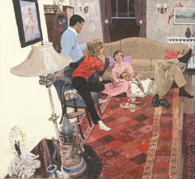
John Alvin John Alvin Bernie FuchsBernie Fuchs Another highly successful illustrator for the time was Bernie Fuchs, he specialized in magazine spreads and worldwide campaign advertisements. His work stood out from the rest, working for magazines such as Good House Keeping, Sports Illustrated and Cosmopolitan to name a few. He changed the direction of Illustration and adapted a new style by painting with a light oil wash rather than the usual acrylic, this gave his work a much looser style. From his artwork collection he has a specific eye for using unusual viewpoints, from this he could create a different narrative and show the reader a new perspective. When mocking up illustrations he would colour sketch the idea from different viewpoints until he reached the right ‘look’ this way of viewing the subject from a different eye level or with obstacles in the way was incredibly innovative in the world of Illustration in the 1970’s.
 My Interpretation of using different angles on everyday subject matter |


 |  |
Nancy in France was another European city that was heavily influenced during the Art Nouveau period the 19th century. A group of artists and designers created Ecole de Nancy or Nancy Art school during the art nouveau movement. These artists grew inspiration from nature and plant forms with the mix of science created art and architecture. Nancy was renowned for its art and design which resulted from art nouveau. Architects created Nancy into an abundance of decorative displays which was influenced by the school of art.
Emile Galle was a talented glass artist who helped combine the art world and architectural to collaborate Art Nouveau. Buildings in Nancy were designed with floral patterns and decoration paired with smooth curves, the architecture was less structural and cornered and instead archways and window frames consisted of a looser style with rounded lines.
The city of Nancy was vastly impacted by the creation of artwork, design and architecture during the Art Nouveau period in France the area was becoming more populated and even challenged Paris for it’s cultural and artistic fame. Other cities such as Glasgow and Vienna’s architecture were more urban whereas Nancy’s was not, the city was relishing in beauty and design. Tactically large retail stores were commercially using architecture from Art Nouveau to stand out and gain commercial success just from the appearance of buildings.
As with any art movement, things are always moving forward, and Art Nouveau died out during the early 1900’s however Nancy carried on creating for another 10 years after it had faded throughout Europe until World War 1 began.
Nancy |  |
Art Nouveau was strong architecturally which makes it very recognisable and at a larger scale however as well as building design and decoration it was seen in many different areas. Art Nouveau was about Artists experimenting from using different materials to techniques but of a wider range than usual, influence was found through Graphic Design, paintings, design, architecture, and craft art.
Glasgow was uncommonly expected to be on the list of places that had a big hit through this time. Again, another group of like minded artists who revolutionised the old Victorian ways of the art world into the modern era.
Glasgow’s art nouveau was slightly different to the romantic architecture in Nancy and luxurious buildings in Vienna, the designs in Glasgow consisted of smooth textures and sweeping lines usually finished with an ironmongery design of floral and natural forms above window frames and doorways. I believe the artistry throughout Glasgow are more in keeping with the traditional gothic architecture, whereas in Vienna buildings such as the Succession are made to stand out, to be noticed.
A charming and strong example of art nouveau in Glasgow can be found in the Willow Tearooms which was designed inside and out by Charles Rennie Macintosh who was a well-known artist and designer and part of ‘The Four’ a group of designers and artists who helped shape Glasgow’s visual arts as it is today. He brought Glasgow into the world of modern art with his take on art nouveau and was highly successful throughout this movement and designed several popular buildings. The Willow tearooms he designed boasts tall flowing lines that represent a modern aspect in the furniture and with beautifully decorated glass. His work was a much more understated type of Art Nouveau compared to Madrid and Vienna where the buildings are loud and show themselves off however the architectural designs created in Glasgow were still of a different style at the time but to our eyes now seem very modern as the lines made are sleek with crisp and delicate detail.
Glasgow


Lastly Madrid was also made popular from the architecture that was created during the early 19th century. Antoni Gaudi is one of the most well known and influential artists from this time. His reputation and interpretation of the Art Nouveau period is most famed for his extremely elaborate designs.
I believe out of all these cities the art nouveau movement was the boldest and striking in Barcelona and Madrid from Gaudi’s work. His representation of natural forms coinciding with religious aspects of his own beliefs added with the technical and scientific engineering were ingenious. His work rivalled all and had influences from traditional Catalan style, gothic, French Avant Garde and Oriental. He designed buildings with fluid forms and bold eccentric colours and patterns. Sadly, Gaudi’s work remains unfinished such as Santa Coloma de Cervelló and the iconic Sagrada Familia, yet they are still jaw droppingly beautiful and ornate, his masterpieces and design innovation lead this revolution of modern art.
I believe out of all these cities the art nouveau movement was the boldest and striking in Barcelona and Madrid from Gaudi’s work. His representation of natural forms coinciding with religious aspects of his own beliefs added with the technical and scientific engineering were ingenious. His work rivalled all and had influences from traditional Catalan style, gothic, French Avant Garde and Oriental. He designed buildings with fluid forms and bold eccentric colours and patterns. Sadly, Gaudi’s work remains unfinished such as Santa Coloma de Cervelló and the iconic Sagrada Familia, yet they are still jaw droppingly beautiful and ornate, his masterpieces and design innovation lead this revolution of modern art.
Madrid


 RSS Feed