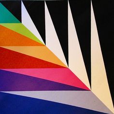
 Max Bills cannot be classed under one label of professionalism, he is an artist, designer, architect, product designer, painter, sculptor and the list of achievements he has had throughout his career is extensive to say the least. Max Bill’s was a Swiss artist born in December 1908 (died 1994 Berlin) in Winterthur. He was an incredibly influential and talented man with a thirst to create. He began his successful career from a young age and already showed his unique understanding of layout, composition, typography and design skills when he won a competition to create a poster for a popular chocolate bar company, he also had his work exhibited at the well known ‘Exposition Internationale des arts decoratifs’ in Paris at the age of 17. Bill’s was studying at the Zurich School of Applied Arts from 1924-1927 as an apprentice Silversmith, however he was expelled and instead went on to The Bauhaus with the prize money he won from the poster design. Max Bill’s was learning at The Bauhaus with several established Artists to our day such as Wassily Kandinsky and Paul Klee. He only attended the school until 1928 however, his design’s and career beyond The Bauhaus reflect how prominent this time of his life was. After The Bauhaus Bill’s went on to be on the Swiss Werkbund and was in an artist group of influential talent in Paris called ‘Abstraction-Creation’ he also founded The Allianz Publishing House for Abstract Artists and The Institute of Progressive Culture, this is just to name a few of his many achievements in life. Max Bill’s is best known for his co-founding in The Ulm School of Design. He was the Architect for the School and the head of department for Architecture and Product Design, understandably as he had already taught this subject at Zurich. Bill’s was heavily involved in the design of the school and its curriculum, he took great inspiration from The Bauhaus’s philosophy and incorporated this into the school’s ways. Max taught at the school until 1957 and was the rector until 1956. During this period of his life he created a vast array of designs which are still manufactured to this day such as the Ulm Stool which he co-created with Hans Gugelot and his designs for Junghans wrist watches and stools. You could say Max Bill’s was like the Hindu goddess Durga, his repertoire for talent were his weapons and each arm was a skill he owned with his creative mind. His style was of a constructivist and was the founder of the movement ‘concrete art’ which is similar to constructivism however when Bill’s applies it he involves heavy colour and no reference to shapes that reflected nature specifically or rules that had to follow cubism, instead his work produced was made up of interesting shapes that just worked. Max Bill’s work that is most notable to me is his Graphic Designs and Advertising Posters. His designs are clear and concise, usually with a san’s serif typeface and in a lower-case format. The layout of his work is elegant and simple, I also admire his stripped-down use of simple geometric forms and lines to add depth to an image which usually take center fold. Furthermore, his particular use of imagery in his Graphic work creates a no fuss straight to the point attitude, but my main appreciation of his work is his bold colour choices in relation to simple geometric forms with the clear attributes of concrete art and constructivism. His style of graphics and typography are a joy of modernity and can be hailed to his Swiss background. After Max finished teaching at the Ulm School, he went on to be a professor in Hamburg at The Institute of Fine Arts. He was designing and creating sculptures up until he was 80. His main aim when he was creating objects and art forms were for the human experience, he defined this in 4 statements: “Utility: the object should fulfil all the functions for which it has been created Usefulness: the choice of materials and the means of production should enhance the usefulness of the object Suitability of form: The form of an object should accord perfectly with its intended purpose. Aesthetic unity: The form should not simply be a response to its use but should be manifest as a harmonious whole, evoking a general impression of beauty.” He was an intellect and creative genius from viewing the correlations of Mathematics, Geometry and Art, his life’s work should always be admired and celebrated. http://www.saturationpoint.org.uk/max_bill.html https://www.britannica.com/biography/Max-Bill http://www.artnet.com/artists/max-bill/ https://www.bagtazocollection.com/blog/2016/3/15/max-bill  Also known as Heyman-Loberstein, Heyman-Marks, Grete Marks, or Greta Pottery. Margarete Heyman was born into a Jewish family on the 10th August 1899 (1990) in Cologne Germany. She was a talented painter and ceramicist and attended the well-known Bauhaus school only for a short period of time, however. She was a rule breaker and exceeded the mold, her work shows how exceptionally talented and original her designs were and how her thinking was massively ahead of the times. Heyman’s ceramic designs were contemporary Avant Garde and often criticized by Socialists. Sadly, I feel her work and career is overlooked and overshadowed by the vast names that are more well known to us as being the ‘stars’ of the Bauhaus. Margarete began her artistic journey by attending the local art school in Cologne, then onto Dusseldorf and finally in 1920 at the age of 21 she was accepted into the Bauhaus. The Bauhaus during this time was directed by Walter Gropius the first director. It was to be the pinnacle of Art and Design schools to attend in Germany and offered vast opportunities to develop and evolve new or existing skills. The Bauhaus boasted of its equality of gender and how this could not determine what craft you could learn-except this was not entirely the case whilst Gropius was in charge, stereotypically he pushed weaving workshops onto women. Margarete Heyman refused, she wanted to study ceramics and got her way onto the course. Sadly, this venture did not last long, Heyman had a voice and was not afraid to use it, she did not ‘fit in’ to the Bauhaus’s standards. She quarreled with her ceramics tutor and left the school after only one year. After Margarete left, she married soon after in 1923 to Gustav Loberstein who was an industrialist. Together with the help of Lobersteins brother they rented then eventually bought a factory to produce her pottery designs under the name of Hael-Werkstatten. Margarete’s work that she was producing was simplistic and modern, consisting mainly of shapes such as circles and triangles. Her most popular and recognizable visuals being teacups and pots that resembled the steep slopes of an upside-down triangle with an ellipse top, and the triangular point cut off to make the base. More specific detailing on her designs were 2 signature circles, one larger than the other, placed on top of one another on the side of the cups, beveled to create a handle then finished off in a wonderful glaze most likely of a pastel color. Heyman’s business was a success with 120 employees with her work being shipped to London and America to be sold in department stores. In 1928 tragedy struck and Margarete’s husband died from a car accident. She continued to run the business with her 2 young sons to raise but with the economic depression in the 1930’s and Nazi Regime in force she was pushed to sell her factory in 1935, (at an unfair price) mainly because she was from Jewish decent but also as a woman with the Nazi’s classing her work of a ‘degenerate’. Margarete was able to move to Britain in 1936 with the help of Ambrose Heal a client from London. From here she lived in Stoke on Trent and continued creating her pottery however this venture did not work out due to her modernistic designs. Eventually she got commercial interest from Minton & Co. but again she clashed with her male colleagues and had to be let go, then her final venture was through Grete Pottery which had to close due to WW2. Margaret remarried Harold Marks an English Educator and relocated to London where she still experimented through pottery but instead painted as her primary. Sadly, Margarete Heyman is an unforgotten piece of the Bauhaus’s history mainly due to her not being there long and also because she did not follow her peers who went on to America, and where Gropius who had a Harvard Teaching post basically shunned artists that he did not class as ‘important’ Bauhaus attendee’s. Heyman’s turbulent career cannot have been helped by the vast names she came under, this meant she was unable to establish herself. The greatest downside to her career though was something she just could not comprehend, having to battle with numerous life changing altercations and being a daring woman in an oppressed time, for a matter of fact the wrong period of time. Whereas I believe 30 years later and onwards she would have been a great success. At least she is getting the recognition she deserves to this day, and you must credit her persistence to establish herself as a designer and artist. https://www.margaretalmon.com/a-margaret-of-many-names-margarete-heymann-lobenstein-and-finally-grete-marks1899-1990/  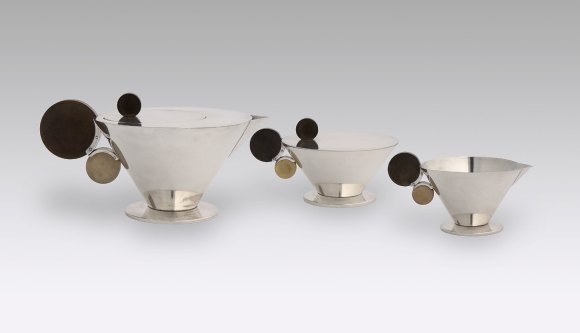 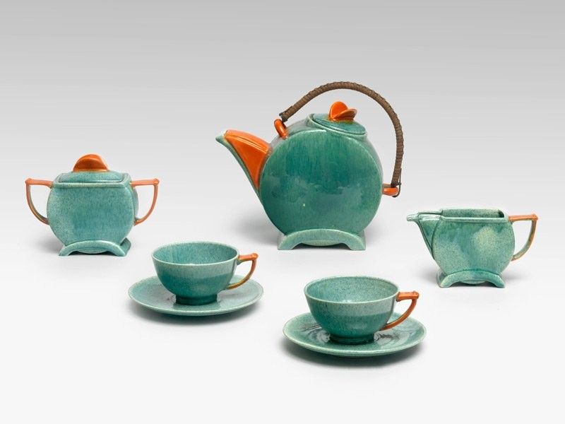  Constructivism was an art movement that began around 1915 in Russia however it really had a lot of influence and drive from 1917 when the Russian Revolution began and was heading into a communist society. The forefathers of this art movement were Vladimir Tatlion, Alexander Rodchenko and Aleksi Gan with other artists such as Varvara Stepanova, Liubov Popova and El Lissitzky who also contributed a great deal during this time of change into a new way of life. The main aim of constructivism during the Russian Revolution was to create socialist art for the people. Artists wanted to convey a message through their creations via posters, architecture, and paintings. Images were not based on style or pure talent however more aimed towards intention, simplicity, and boldness so that art could be interpreted and understood by everyone not just the few. Gustav Klutsis was a highly skilled Graphic Designer and Photographer, he was a strong part taker during the constructivist movement and was highly influenced by the communist leadership of Stalin and created propaganda posters throughout the years for the communist party, although sadly even as a true supporter of Stalin’s leadership and of the communist party Gustav was one of many who died during Stalin’s Great Purge during 1938. Another very influential artists during the constructivist movement was El Lizzitzky. He was a talented Designer, architect, typographer, and painter in Russia. Lizzitzky’s actual name was Lazar Markovich Lizzitzky however he adopted this shortened version of his name in 1919 after becoming highly interested in Kazimir Malevich who taught and then ran the People’s Art School in Vitebsk- where Lizzitzky had taught previously and was the creator of the movement Suprematism. This changed El Lizzitzky’s understanding of art by transforming geometric forms into stylized artwork, thus creating exhibitions, paintings and propaganda posters which eventually led him to the constructivist era. During the turn of the revolution from 1917, Lizzitzky and Klutsis were highly political and created many pieces of art work and propaganda to portray their political views and produce art work for the masses that could be seen everywhere and for everyone, constructivism was beginning of a new bold era of art in Russia mainly, that focused on the construction rather than composition. One of the most famous and recognizable pieces of constructivist artwork was produced by El Lizzitzky in 1920 under the name ‘Beat the Whites with the Red Wedge’. This artwork is a lithograph poster in red and black on white woven paper. El Lizzitky was well known for his colour schemes and again he does not disappoint. The image may be of simplicity however the use of the bold geometric forms and clashing tones of red, white, and black convey a deeper meaning. This piece was created after the Russian Revolution but is a celebratory image. The striking red triangle takes centre fold which depicts the Red Army (revolutionaries) piercing the anti-communists White Army’s defence using the definitive white circle as a symbolic metaphor which again takes the viewers eyes to this point. The image is surely conveyed as a battle, the bold black line that diagonally crosses the scene can be viewed as a frontline of an army, the black contrasting colour over the white portrays the old and negative ways that life has been and is a strong indication of death. The other half of the poster is the light and bright white on the Red Army’s side which creates a sense of victory and the new positive ways of life for society, pushing out the old and in with the new. He uses the geometric forms of the main triangle and smaller forms around the image onto the black which could be mistaken to resemble spear heads, bullets or missiles which all have the same equal meaning of War. The basic use of colour and forms is a way that Lizzitzky wanted to be able to speak to the public a message that does not need to be read but interpreted for those who view it, such as the little use of typography this poster has. Like Lizzitzky and many of the constructivists posters were adopted throughout this period in time, Gustav Klutsis was very similar in respect to Lizzitzky and using the power of posters for propaganda but by using images again to convey a stronger meaning and the little use of typography to let the viewer understand what is not needed to be said, whereas posters seemingly to us can be more informative and contain more text for the viewer, whereas propaganda does not inherit this method. Gustav Klutsis created many propaganda posters in his time, 10 years after El Lizzitzky’s ‘Beat the Whites with the Red Wedge’ he created ‘Under the Banner of Lenin’ in 1930. This poster was produced by cutting and pasting photographs and layering on top of each other called Photomontage. This method of production was quick and inexpensive, with the idea in mind to produce large scale posters and a lot of them. The images in this poster display’s Lenin and Stalin’s face’s photographed laid over one another merging halfway between the images as if to form one. The use of photography creates a more life like approach, to show the viewers of society who these leaders are with the focus being on their eyes, as if they are directly staring at the viewer. The technique of merging Lenin’s face with Stalin’s underneath gives the message that Stalin is in Lenin’s shadow with the use of the contrasting light where their faces meet evokes a deeper understanding that Stalin and Lenin are so connected as a political match that they are of one an equal match and strong political agenda. Klutsis’s uses the bold red geometric shape behind the face’s which could be led back to where Lizzitzky started to use the Red Wedge to depict the Red Army, to remind the viewers of the Revolution. In the foreground of the poster contains pictures of manufacturing and construction, this is to show the people they are for the working man, they are for the future of industrialisation with the use of diagonals seemingly towards the top of the page this could indicate the future and expansion of Russia with Stalin and Lenin being the forefathers of this generation. Propaganda posters as such were heavily dependent on artists, the Government helped with Klutsis’s efforts as they needed to shift the mindset at the masses and have clear concise messages which only artists like the constructivists could convey, this was especially important as these posters had to be everywhere in built up cities to rural farming villages. The images used from Lizzitzky’s work and Klutsis’s, were to be given to the people for all to understand and see even without the heavy use of typography. Russia had many poor and underdeveloped areas with less educated people who could only interpret what they saw from posters. This was the importance of the constructivist work for the people. 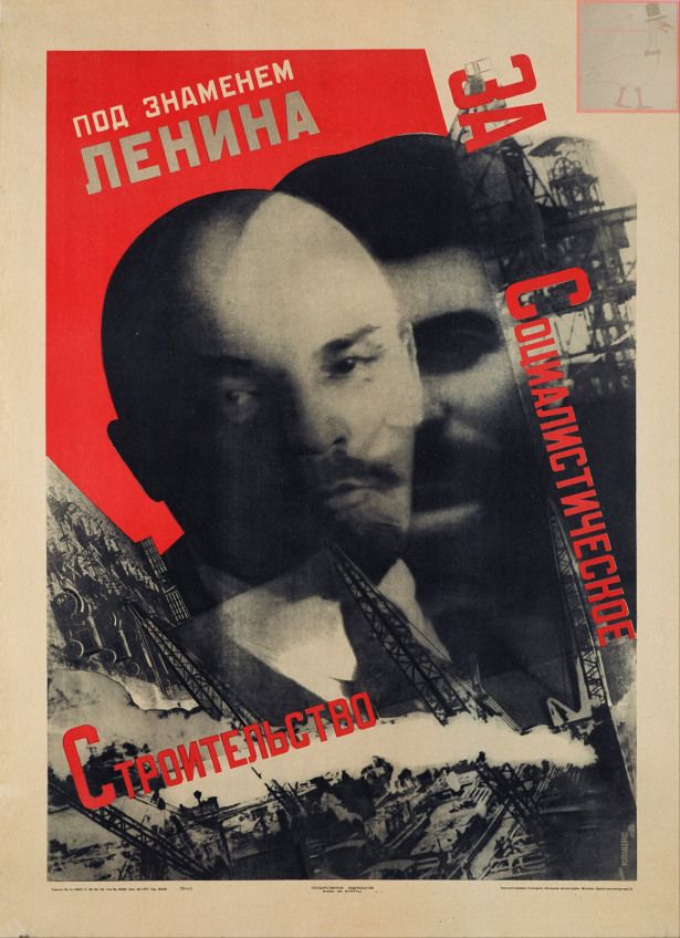 https://www.dailyartmagazine.com/beat-the-whites-with-the-red-wedge/
http://dighist.fas.harvard.edu/projects/russiaglobal/exhibits/show/objects/item/68 https://properganderpressblog.wordpress.com/2016/11/22/stalin-poster-of-the-week-gustav-klutsis-under-the-banner-of-lenin-for-socialist-construction-1930/#:~:text=This%20well%2Dknown%20poster%20of,literally%20in%20Lenin's%20shadow.&text=Klutsis%20became%20a%20prominent%20graphic,the%20goals%20of%20the%20regime. https://utopiadystopiawwi.wordpress.com/constructivism/el-lissitzky/beat-the-whites-with-the-red-wedge/ http://dighist.fas.harvard.edu/projects/russiaglobal/exhibits/show/objects/politics/klutsis https://www.icp.org/browse/archive/constituents/gustav-klutsis?all/all/all/all/0 https://monoskop.org/Gustav_Klutsis https://www.tate.org.uk/art/artists/el-lissitzky-1519 https://www.britannica.com/biography/El-Lissitzky |
Archives |

 RSS Feed